In this article we will continue to build our Sencha Touch MVC app we’ve started in part 1 and part 2. This time we will explore different ways to call a controller action.
A controller action can be called in three ways:
- Using the route as a value for the href attribute of an anchor tag: <a href=”#route”>Some Route</a>
- Using the Ext.dispatch and Ext.redirect functions: Ext.redirect(‘route’)
- Calling the controller’s action directly: Ext.ControllerManager.get(‘SomeController’).someAction() or this.someAction() from the same controller action.
First, let’s add another action in our HomeController.js named about.
// about action
about: function()
{
	if ( ! this.aboutView)
	{
		this.aboutView = this.render({
			xtype: 'HomeAbout',
		});
	}

	this.application.viewport.setActiveItem(this.aboutView);
},
Now let’s create the view for this action (app/views/home/HomeAboutView.js):
App.views.HomeAbout = Ext.extend(Ext.Panel, {
    html: '<h2>About</h2> <p>MvcTouch is a Sencha Touch demo application.</p>',
	scroll: 'vertical',
	styleHtmlContent: true,
	style: 'background: #d8efed',
});
Ext.reg('HomeAbout', App.views.HomeAbout);
To make things look nicer let’s create a style sheet file (res/css/style.css) with the following content:
a.menu-item {
	display: block;
	padding: 1em;
	font-weight: bold;
	text-decoration: none;
	text-transform: uppercase;
	border-radius: 10px;
	box-shadow: 1px 1px 4px #768395;
	background: -webkit-linear-gradient(top, #fff, #ddd);
}
Note: don’t forget to include the view and the style sheet in index.html.
Calling a controller action using a HTML link
First, we’ll call a controller action by using a HTML link. For this, we will modify the html property of the HomeIndex view like this:
html: '<a href="#Home/about" class="menu-item">About</a>',
In the href property of the anchor tag we add the route prefixed by a pound sign.
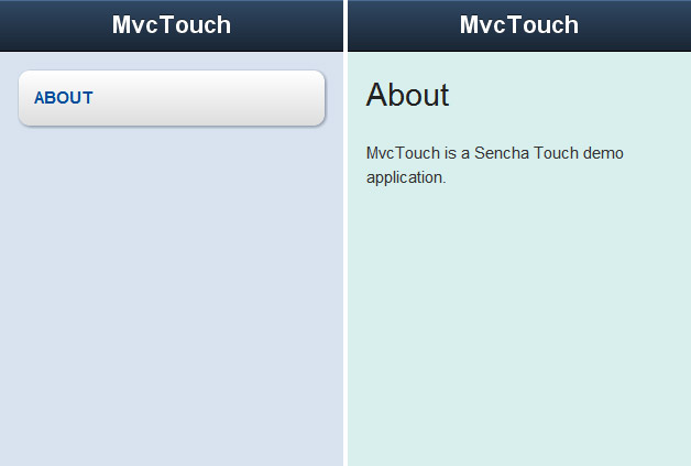
Now open index.html in your WebKit based browser and you’ll see the about link. If you click on it you should be redirected to the about action.
When you are on the about action you can click the browser’s back button to go back to the index action. While you are moving back and forth between this actions you should see something like this in the url: index.html#Home/index and index.html#Home/about.
Note: If you have index.html#Home/about in the url and you click refresh in a desktop browser the application will start with the about action being called first, not index one. Remove the part after index.html to start in the default route.
Using the Ext.redirect function to call a controller action
While clicking the browser’s back button to go back to the index action may be ok in a desktop browser, on a mobile device that doesn’t have a back button, like the iPhone, there will be no way on getting back. Let’s fix this by adding a back button to the toolbar.
To add a button to the toolbar we need to fill its items property, so open app/views/Viewport.js and make the docked toolbar to look like this:
xtype: 'toolbar',
title: 'MvcTouch',
items: [
    {
    	text: 'Back',
    	itemId: 'backBtn',
    	ui: 'back',
    }
],
Since we didn’t specified an xtype, the toolbar items will use the button xtype and will be instances of Ext.Button class.
The text property of the button will be the button’s label.
Using the itemId we can get the button’s object instance. We’ll use this to hide and show the button only when apropiate, but most importantly will be used to attach a method to be called when the button is tapped/clicked.
The ui property defines the style of the button. Setting it to back, the button will be arrowed-like.
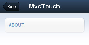
Here’s how the toolbar should look:
Let’s add a handler to out toolbar button
To add a handler function to our button we need first to get an instance of it and than calling the button’s method setHandler.
So, open the Home controller (app/controllers/HomeController.js) and in the about action, above
this.application.viewport.setActiveItem(this.aboutView);
add the following:
var backBtn = this.application.viewport.query('#backBtn')[0];

backBtn.setHandler(function(){
	Ext.redirect('Home/index');
});
To get the instance for the back button we take the one for the viewport and call the query function on it. With this function we can search components with a similar syntax to a CSS selector, so #backBtn should look familiar to you if you know CSS.
The query function executes an Ext.ComponentQuery.query and returns an array of components. Since there is only one component with itemId backBtn, the first item of the returning array is our toolbar button.
To find more about component queries you can go here to read what the Sencha Touch documentation has to say.
Now that we have the button’s instance we can attach an handler to it to be triggered when it’s tapped/clicked. We do this by passing a function to the setHandler button’s method. In this function we use Ext.redirect to go back to the index action by passing it’s route.
Ext.redirect is a shorthand for Ext.Dispatcher.redirect and, as the sencha documentation describes, “dispatches a request to a controller action, adding to the History stack and updating the page url as necessary”.
Now you can test the button. From index go to about and click the back button: you should be redirected back to index. Notice that the slide animation is from right to left and the natural transition would be the other way around. We’ll fix this in the next step.
Using the Ext.dispatch function to pass optional parameters when calling a controller action
As you’ve seen in the previous step, we need to fix the slide animation when going back to the index action.
The index action displays it’s view like this:
this.application.viewport.setActiveItem(this.indexView);
The setActiveItem function accepts a second parameter: “the cardSwitchAnimation used to switch between the cards. This can be an animation type string or an animation configuration object” (quote from Sencha Touch documentation).
So, we can define how the index view should animate when displayed using this second parameter, but we need to do this only when we are redirected to it from the about action. How we accomplish this? Well, by using the Ext.dispatch function.
Ext.dispatch is a shorthand for Ext.Dispatcher.dispatch, function that is used internally by Ext.Dispatcher.redirect (Ext.redirect). We’ll use this function because we can pass parameters to the action function we’re calling with it.
Go to the about action and replace:
backBtn.setHandler(function(){
	Ext.redirect('Home/index');
});
with:
backBtn.setHandler(function()
{
	Ext.dispatch({
		controller: 'Home',
		action: 'index',
		historyUrl: 'Home/index',
	});
});
The dispatch function accepts as the only parameter an object with at least the controller and action to dispatch to as its properties.
The historyUrl property is the route that will be added to the url (index.html#Home/index).
Using Ext.dispatch as we’ve done above we’ve accomplished the same thing as Ext.redirect(‘Home/index’).
If the historyUrl property it’s not added to dispatch function passed object here’s what will happen: when you’ll be on the about action there will be index.html#Home/about in url, after you click on the back button you’ll be redirected to index action, but the url will still have #Home/about in it and if you try to click the about link from index view nothing will happen because the app will think that you are already on the about action because of the url. You should comment the historyUrl property and test for yourself to understand better.
Now let’s modify the object that we pass to the dispatch function like this:
Ext.dispatch({
	controller: 'Home',
	action: 'index',
	historyUrl: 'Home/index',
	//
	animation: {
		type: 'slide',
		reverse: true,
	},
});
We’ve added the animation custom property which is an object with specific animation properties. This object will be passed to the setActiveItem function from index action. We can add how many custom properties we want. We see next how we can access this custom properties we pass to the dispatch function.
Modifiy the index action like this:
index: function(options)
{
    ...

    this.application.viewport.setActiveItem(this.indexView, options.animation);
},
Every action will have an Ext.Interaction object passed to it. In this object will find our custom properties we pass to the Ext.dispatch function. We’ve named this passed object options, as you can see on line 1 of the code above.
The animation property we’ve set will be accessed like this: options.animation, as you can see on line 5 of the code above.
Now you can test! When you click the back button the index view should slide from left to right.
For more info on animation properties you can check Ext.anims and Ext.Anim in Sencha Touch documentation.
Hiding and showing a toolbar back button
The toolbar back button should be visible only when is needed, so on the index view it should be hidden.
In the index action above:
this.application.viewport.setActiveItem(this.indexView, options.animation);
add:
var backBtn = this.application.viewport.query('#backBtn')[0];
backBtn.hide();
In the about action just under:
var backBtn = this.application.viewport.query('#backBtn')[0];
add
backBtn.show();
If you test now, the back button should be visible only on the about view.
Calling a controller action directly
Let’s add a search feature to our app. For this we’ll create another controller.
Create a file named SearchController.js in controllers folder, include it in the index file and add the following in it:
Ext.regController('Search', {

	// index action
	index: function()
	{
		alert('Search index working');
	},
});
We’ll trigger our controller by clicking a button that will always be present on the toolbar, so let’s add that button to our viewport’s toolbar:
items: [
    {
    	text: 'Back',
    	itemId: 'backBtn',
    	ui: 'back',
    },
    {xtype: 'spacer'},
    {
    	itemId: 'searchBtn',
    	iconCls: 'search',
    	iconMask: true,
    	ui: 'action',
    },
],
Between our toolbar buttons we’ve added an item with xtype spacer (Ext.Spacer). The spacer will push the buttons to the sides.
We’ve added two new properties to our search button: iconCls and iconMask. The iconCls is “a css class which sets a background image to be used as the icon for this button” (quote from Sencha Touch documentation). By setting its value to search the button will have a magnifying glass as its background image. To make this feature work, we also need to set the iconMask property to true.
We’ve also set the ui property to action so that the search button will have a different style.
Here’s how the button should look:
Now we must set the handler function for the search button. Since this button will always do the same thing, we can set it’s handler in the app launch function like this:
launch: function()
{
	this.viewport = new App.views.Viewport();

	this.viewport.query('#searchBtn')[0].setHandler(function(){
		Ext.ControllerManager.get('Search').index();
	});
},
Using the Ext.ControllerManager‘s get function we are able to retrieve a controller instance using the name we’ve used to register. After that we can simply call it’s actions like regular functions.
If you test the search button now by clicking on it an alert should popup with the folowing text: Search index working. This is the alert we’ve added in the search controller index action.
Not it’s time to create and render the search view.
We want our search view to have a search field and a cancel button at the top, to slide from bottom to top and to have a semi-transparent background so that the view under it could be visible.
First, create a file named SearchIndexView.js in app/views/search (the search folder will need to be created), include it in the index file and add the following content in it:
App.views.SearchIndex = Ext.extend(Ext.Panel, {
	cls: 'search-panel',
	fullscreen: true,
	floating: true,
	floatingCls: '',

	dockedItems: [{
		xtype: 'toolbar',
		items: [
	        {
	        	xtype: 'searchfield',
		        flex: 1,
	        },
	        {
	        	text: 'Cancel',
	        	itemId: 'cancelSearchBtn',
	        	ui: 'action',
	        }
        ],
	}],
});
Ext.reg('SearchIndex', App.views.SearchIndex);
We’ve set the cls property to search-panel: “an optional extra CSS class that will be added to this component’s Element (defaults to ”). This can be useful for adding customized styles to the component or any of its children using standard CSS rules.” (quote from Sencha Touch docs). We’ll use this class to make the view’s background semi-transparent.
The search view will be rendered on top of the other views and will not be displayed as a child of the viewport, so we need to set the fullscreen property to true to force the component to take up all the available space.
Because we want our search view to have a slide animation, we need to set the floating property to true, otherwise the view will be displayed with no animation. Here’s what Sencha Touch documentation says about it: “Create the Component as a floating and use absolute positioning. Defaults to false.”
When the floating property is true, a class of x-floating will be added to the component. This class adds some CSS rules that we don’t want, like borders. To prevent this class by being added we set the floatingCls property to an empty string.
We’ve added the search field and the cancel button in a docked toolbar. In this part of code the flex property (line 12 in the code above) will be set to 1 to make the search field have the max width it can (the cancel button will be pushed to the right).
For more on the flex property and layouts you can watch the Intro to layouts Sencha Touch screencast.
Now open res/css/style.css and add the following to it:
.search-panel {
	z-index: 10000;
	background: url(../images/search-panel-bg.png) repeat;
}
We have to set z-index to a big value to make sure that the search view will be on top of everything. We’ve also added a semi-transparent background image that can be downloaded from here. Download the image and add it to res/images folder.
Now it’s time to render our view
Open the search controller (SearchController.js) and modify it’s index action like this:
index: function()
{
	if ( ! this.searchView)
	{
		this.searchView = this.render({
			xtype: 'SearchIndex',
		});

		var cancelSearchBtn = this.searchView.query('#cancelSearchBtn')[0];
		//
		cancelSearchBtn.setHandler(function(){
			this.searchView.hide();
		}, this);
	}

	this.searchView.show({
		type: 'slide',
		direction: 'up',
		duration: 500,
	});
},
First, let’s look at line 16 in the code above. Because we wanted the search view to show on top of the other views and not just be switched to it, we can’t make use of the setActiveItem function. So, we simply use the view’s show method. This function accepts an optional animation parameter than can be either a string containing an animation type, like slide, or it can be an object with animation properties, like the one we’ve passed to it.
On line 11 we set the handler for the cancel button to a function that hides the search view. The hide function also accepts an animation parameter. Since we didn’t passed a parameter to this function, the view will be hided with the animation used in the show function, but in reverse.
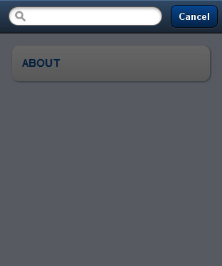
Now you can test. The search view should look like this:
This is the end of part 3!
You can download the current phase of the project from here.
If you have questions, suggestions or improvements don’t hesitate to use the form below.


